One of the most popular genres of websites is photography. It’s no surprise that this is one of the genres where Divi thrives. If you need inspiration, you’re in luck. Here’s a look at the top 15 examples of photography sites using Divi.
All are excellent examples to pull inspiration from. I’ll point out what I like the most about each one. I hope you like them as much as I do. They’re in no particular order.
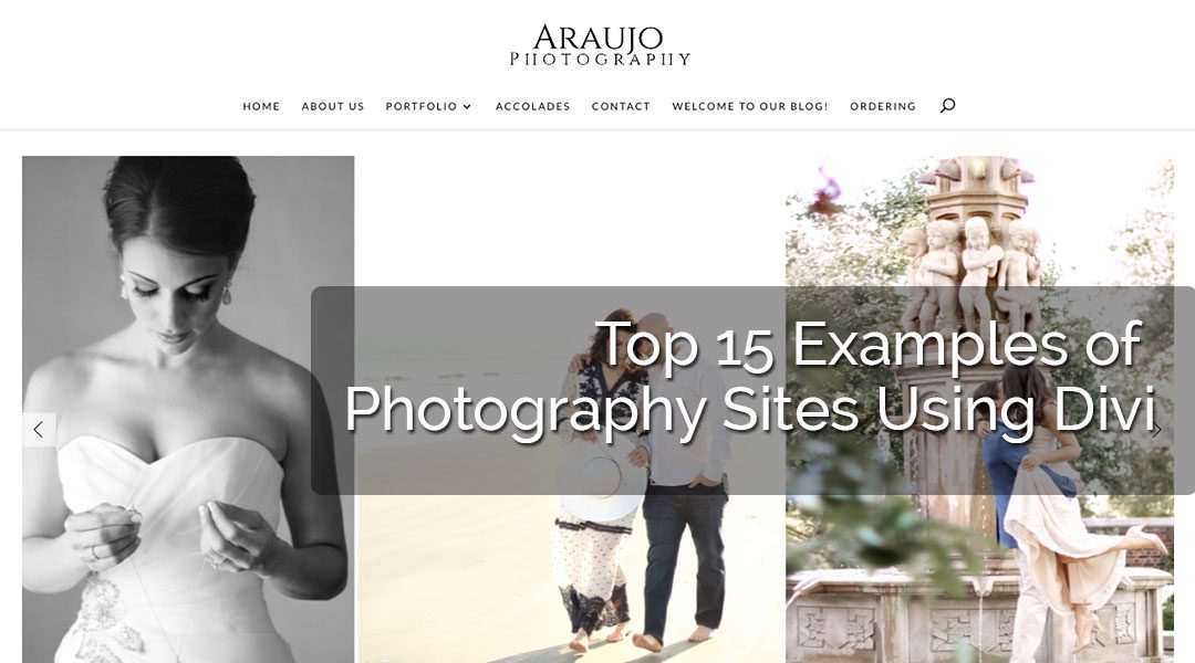
1. Araujo Photo
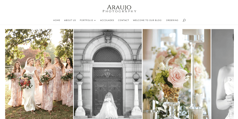
This site uses soft colors and elegant fonts that match the wedding genre. The image slider displays large images with the same height but different widths. It has one of my favorite ways to use CTA’s to show the services: square photos with styled borders and a styled button in the center as a label. The testimonials, toggles, contact form, and blog follow the same elegant styling.
2. Ryan Welch
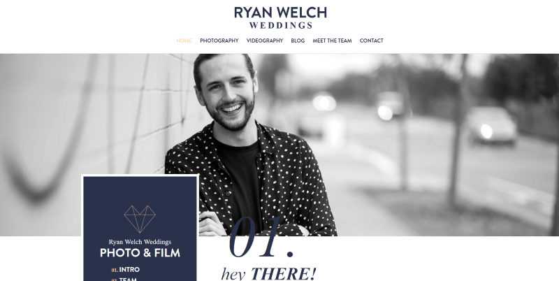
This site uses dark blue for a lot of the title fonts and backgrounds, and tan for other fonts and highlights. A block of color with clickable numbered labels show the sections of the homepage. Each section includes a block with a title and those same numbers, all of which overlap the section’s image and next section.
3. Dawn Martin Photography
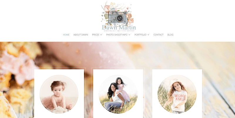
This one creates a unique hero section with a background image and CTA’s. The image uses soft focus and lighting to match the colors from the site. The CTA’s are built with white blocks that include a styled border, circular images, title, and description. The portfolio section uses circular images with styled borders and buttons. I love the artwork in the logo and highlights throughout the site.
4. Julie Ferneau
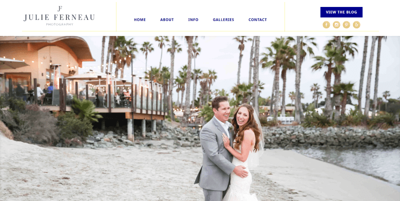
This site includes an interesting header and footer design with a border to divide the sections. Images overlap sections and include white borders to stand out from the sections they live in while blending with the sections they overlap. Buttons include a gold foil pattern. Gold is also used for the highlights including social buttons and the border in the menus. The portfolio shows images in a full-screen slider, which reveals part of the next image.
5. Ellen Hansen Seniors
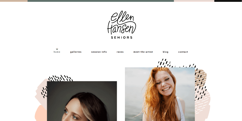
This one displays images within a set of sliders to create an interesting layout over background patterns. A block with styled text describes the site. Text, buttons, and background highlights are in tan or slate. Some of the backgrounds use both. The blog sidebar also uses this same styling as the rest of the site. I love the icon in the menu that shows the current page.
6. MK Weddings
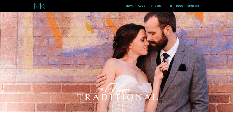
This site uses full-width background images with boxed titles to introduce each section. Text with borders create CTA’s to the About, Portfolio, and Get in Touch pages. This same design is used to create links to the portfolio pages, which displays images with the text. I like the green for the highlights. I also like how individual galleries are created with the blog.
7. Your Photo Story
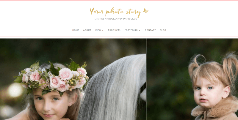
This site displays a full-screen image slider in constant motion until you hover over it. Elegant shades of gold and peach create highlights such as drop-caps and links. I like the way it uses quotes to break up sections of text. Parallax backgrounds with titles in overlays introduce each section. Services are shown with styled toggles.
8. Megan Kelsey Photography
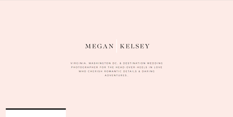
This website creates lots of open space to tell the story. The header is a full-screen block of peach with a title and description. A block that creates a menu overlaps the next section. A two-column section uses elegant, extra-large, text to welcome visitors. I love the portfolio section that’s built with an overlapping mosaic. The blog slider section displays the title in an overlapping block.
9. Eddie Judd Photography
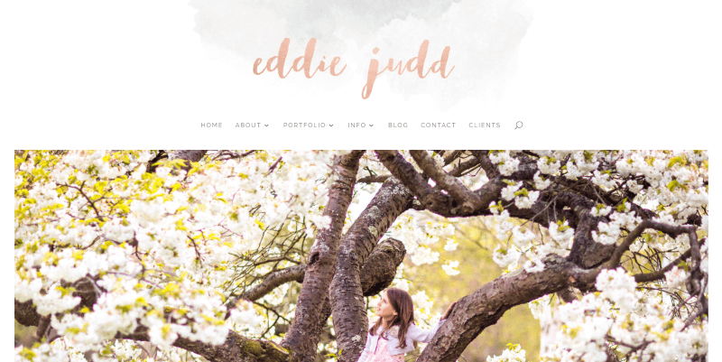
This site uses a large elegant hand-written font to create the logo. This same peach gradient is used as highlights throughout the website. A full-screen image slider and a box with a gradient border overlaps the next section. A multi-layout image mosaic creates links to services. I love the blog section on the homepage, which displays a black-and-white background, the latest post, and a title within a box that sits behind and underlaps the blog post.
10. Lane Weddings
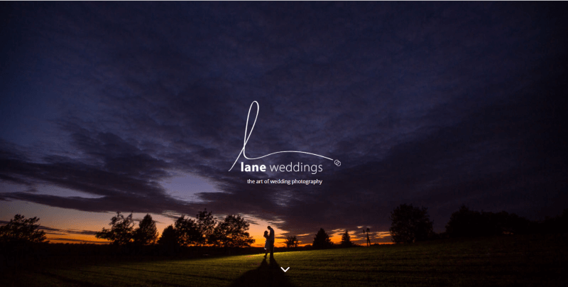
This one includes a full-screen header with a logo and tagline in the center. Numbered drawings provide links to the pages. The same style of drawings describes the work process. I love the blog section. It displays 2 posts per row, showing the image with the title and date over the image. One post takes 2/3 of the row with the other taking 1/3. This layout alternates as you scroll and includes a load more button at the bottom.
11. Devlin Photos
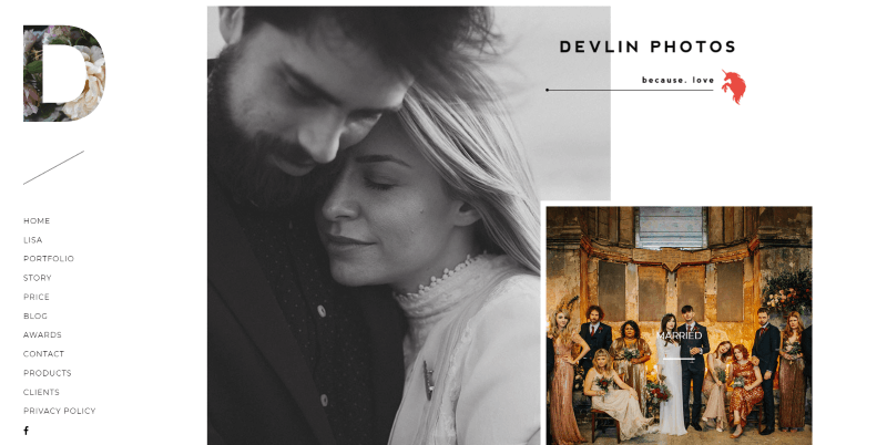
This website uses a vertical menu with a logo that’s made of a cutout letter that shows an image. A title with a tagline on the right overlaps the first image, which is also overlapped by the second image, which takes you to the portfolio. Several images link to pages. These use a nice red overlay. Another interesting section includes an image and title overlapping a slider. The blog includes images in multiple sizes with titles in an overlay. The portfolio follows this same design.
12. Lorrain Eclaire
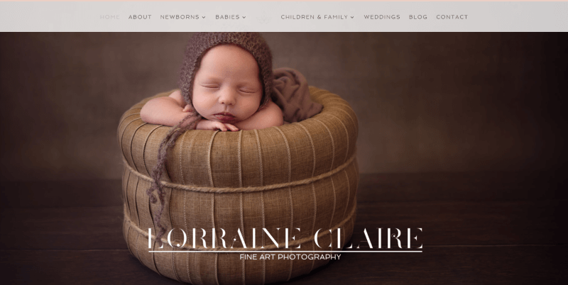
This site uses warm and rich colors that match the backgrounds of the photos. It includes a full-screen image slider with a title and tagline on the first image. Numbered blurbs display the services and include an elegant icon which is also used as the logo, within section titles, and the pin-it button. Blog posts are used for galleries. The blog’s sidebar is styled to match the site.
13. Amanda Diaz
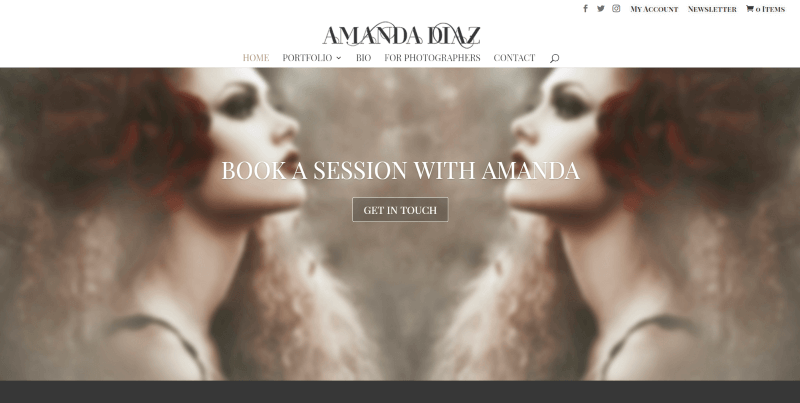
This site places the title over a full-width background image with a CTA. The portfolio displays large images in four columns that take the full width of the website. I love the colors in the backgrounds for the titles and newsletter sign-up form, buttons, selected text, and of course the photos. Even the newsletter popup form looks interesting.
14. Florida Museum of Photographic Arts
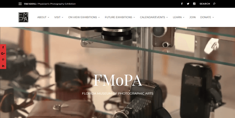
This is the site of a museum about photography and it’s made with Extra. It includes a full-screen header section with a background video, logo, and tagline in the overlay. Current exhibits are shown within a slider followed by the two latest blog posts. It makes great use of the mega menu. The posts use nice and simple layout with drop-caps.
15. Jordanna Marston
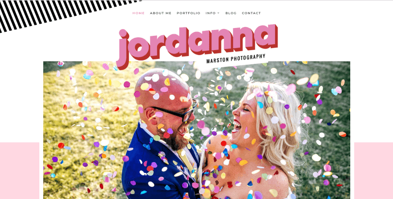
This one uses playful colors and patterns throughout the website. It also uses several overlapping effects; placing images over two sections, one image over another, the logo over an image, etc. The line patterns and bubbles are interesting. I also like the blog design, which displays photos in a mosaic with the title in an overlay that shows on hover.
Ending Thoughts
That’s our look at 15 examples of photography sites using Divi. They include some interesting colors and layouts. I especially like the way they display their photos within the header area, galleries, and portfolios. They’re sure to inspire you for your next Divi design.
Which of these photography sites using Divi is your favorite? Let us know in the comments.
I think my favourite is number 13 by Amanda, very different.
Thank you, interesting!
Please note that Item 10 has wrong web link – should be https://laneweddings.com/
What? You did not even mention my photo site? wtf? Ok, I’m kidding. These are very beautiful site indeed. I wonder if there are wp child’s themes specialized in photography, but rather a portfolio than marriage ? Thx and have a nice day 😉
I am sure there are more interesting photography-sites than these boring wedding pages.
I wonder why Americans (I guess you are american?) are so crazy about wedding photography????
There are photographers with good websites and more interesting subjects….
I love Divi but wish the gallery/image options were more robust. I pretty much always have to purchase a license for The Grid (as did the majority of the above sites) or Revolution Slider to get what I need as far as beautiful image layouts. Also, the incredibly talented Melissa Love (aka The Design Studio) was behind many of the wonderful and interesting sites mentioned. She’s amazing 🙂