Typography is one of the most important design elements of any website. The right choices can draw a reader in, help keep their attention, and lead them through your call to action. The wrong choices can send them running as soon as your page loads, give them the wrong impression about your website, or cause them to not take you seriously.
Divi has lots of fonts built-in and its tools make them easy to style. In this article, we’ll look at the Divi fonts list and typography rules to help you make the best decisions for your website. I’ll show examples of good font choices using the Divi child themes available here in the Divi Space shop.
Divi Fonts List
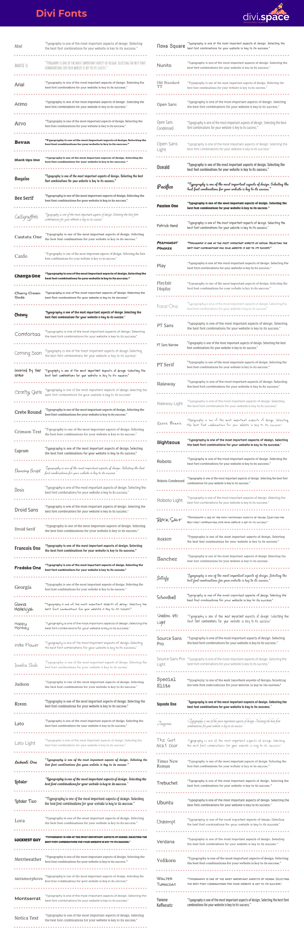
Download PDF: Divi fonts LIST
It shows the font name and sample text, both printed with the font itself. This list is downloadable as an 8-page PDF that you can print or use from your computer.
Divi Space has created a complete list of the fonts available in Divi. The list shows the font name and sample text, both printed with the font itself. This is the easiest way to see every font in Divi to help you choose the right fonts for your website. This list is downloadable as an 8-page PDF that you can print or use from your computer.
Practice Solid Principles
Typography is a visual art-form with principles that guide it. Learn the terms and measurements to understand how typefaces work. Just like any art-form, once you learn the rules you’ll know how to bend or break them so any variance from the rules looks to be on purpose rather than haphazard.
This includes understanding the space between the fonts, the space between the lines, the extenders, etc. Be sure to check how the font looks in all weights, in italics, and in bold.
Place Readability First
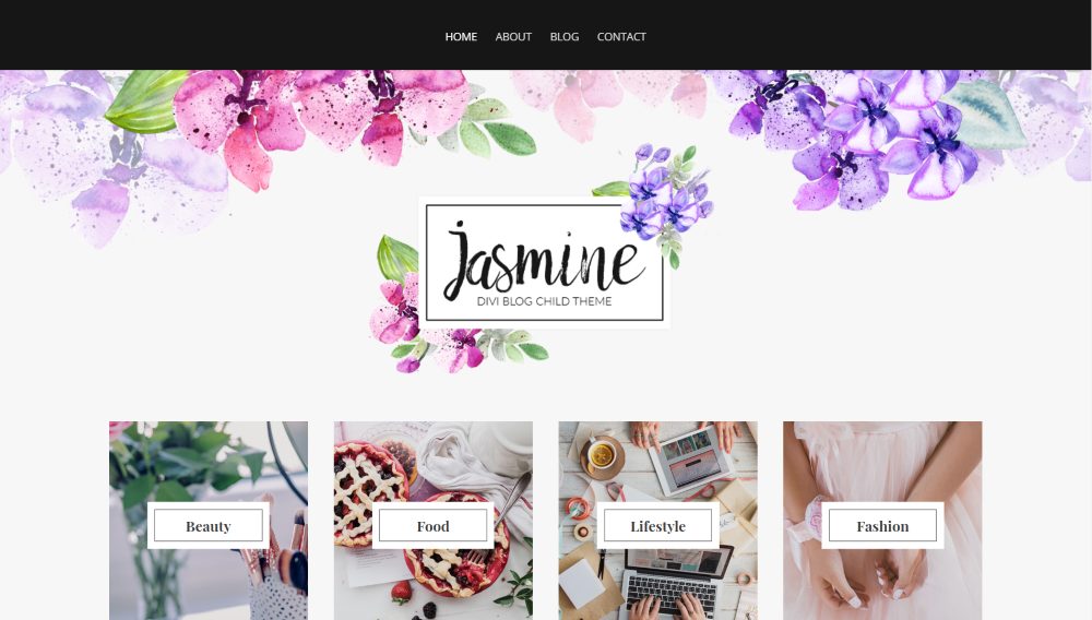
Text that’s readable should always be the goal. This includes the size and shapes of the fonts, the colors of the fonts and backgrounds, effects, etc. You don’t want users to spend time trying to figure out what a word is because the font is not legible. Also, you don’t want them to strain their eyes because there isn’t enough contrast or because the colors clash too much.
The example above is from the Jasmine child theme.
Choose Good Colors
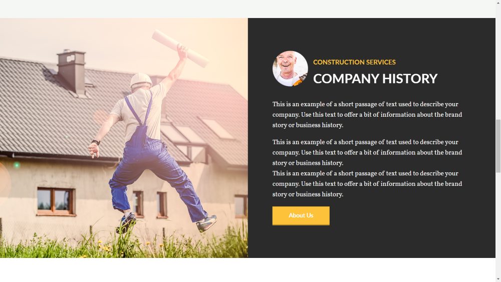
Color is one of the most important design elements of every website. This includes fonts and the backgrounds they’re placed on. Use color theory to determine the best colors for your website. Choose the colors that match the mood you want for your audience. Make sure the font colors are not too distracting and that they read well against the background and effects.
The example above is from the Construction child theme.
Pay Attention to how Fonts Communicate
Choose fonts that communicate well to your target audience. The fonts should fit the market. Fancy fonts don’t work well with kid’s websites and multi-colored kid’s fonts don’t work well with wedding planners. The styles and colors communicate to the audience the genre and type of content they should expect to find on a website.
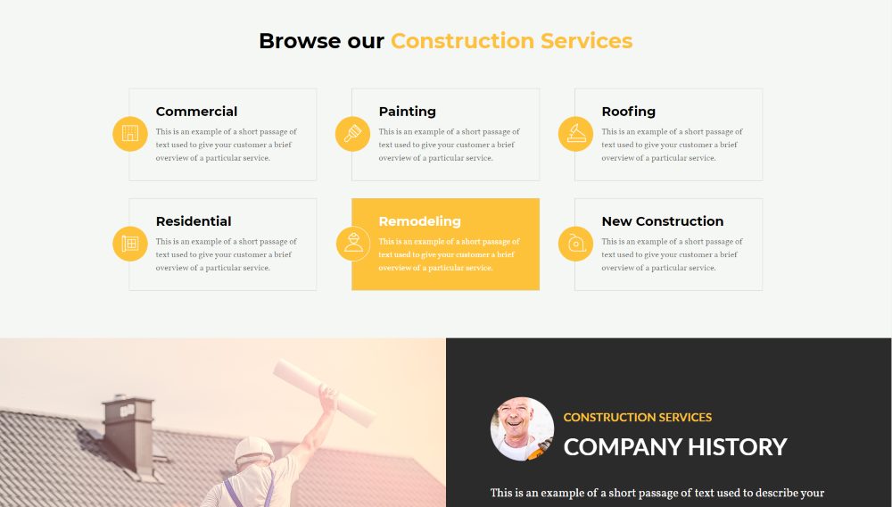
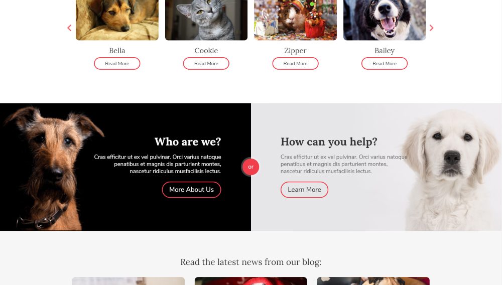
Don’t Use Too Many Fonts in the Same Website
Don’t use more than three typefaces for your website. Using too many fonts and styles can become distracting. It is okay to use 2-3 fonts as long as they work well together (font pairing). It’s best to use one for the body (p) and one for the main headings (h1-h5), and one for the subheadings. If you use h2 as your headings, the subheadings would be h3-h5.
The example above is from the Construction child theme.
Visual Hierarchy
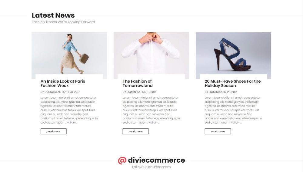
Creating a visual hierarchy will stress certain lines of text over others. This can separate sections of text and guide the reader. This can be done by utilizing h1-h5 and p throughout the text. Quotes can help too. Use them along with whitespace to create a clean design that’s readable while drawing the attention of the reader and highlighting what’s important. But remember, less is more in this case. You just need a heading, a subheading, and a body font.
The example above is from the eCommerce child theme.
Make Smart Choices for Font Pairing
Multiple font families can, and should, be used together, but they should be paired carefully. Font families should have enough contrast in style to look like different typefaces but still be similar enough that they look natural together. Using too many typefaces can confuse the reader as to which elements of text are the most important. Two-three fonts are ideal. You can use up to two more if you have extra-long articles.
Use different typefaces for a heading and a subheading in order to build a visual hierarchy. The subheading font should be similar enough to the heading font that it doesn’t contradict it, but it should also be different enough that they’re not easy to get confused.
The example above is from the Nonprofit child theme. For more information about font combinations and using custom fonts with Divi, see the article 10 Best Font Combinations for Divi Websites.
Measuring
Fonts are measured in points. Because of the vast level of design that can go into a typeface, not all fonts of the same point-size are the same size. For example, lower case letters can be much smaller than upper case letters, or they can be about the same size as upper case letters.
Measure them to ensure the space for the text will work with your design. Measure the total height of the fonts (x-height) and pair fonts with the same x-height. The leading is the height of the font plus the space to the next line. Also measure its width (set width), which is the width of the font plus the space to the next character.
Kerning
Kerning refers to the space between the characters. If there’s too much space, the text can have unnatural breaks that can create two words instead of one. If the kerning is too small, letters can crash into each other and create one word where there should be two. Both problems affect readability. Kerning is especially important for headings and logos, since they’re often larger text with shorter sentences and stand out more.
Fix Widows and Orphans
In order to keep the layout of the text as elegant as possible, fix the widows and orphans. A window is a line of text that has pushed into the next column. An orphan is a single word on a line. These can be fixed by adding padding to the Divi text module or adjusting the spacing for the column in order to control the length of the lines.
Text Alignment
We have several font alignment options with WordPress- left, center, and right. Divi adds a fourth option called justified, which justifies both the left and the right sides of the text. These alignment options change the position of the text and affect the readability.
Left-aligned is the most common because it’s the easiest to read. Left-aligned and justified are popular for body text. Left and centered are popular for titles. Centered is popular for blurbs. Right-aligned is popular for bullet points with an image to the right. Use them with various line widths to see what works best for you.
Grids
Design your layout within a grid for the best placement of your text. Think of it as the rule of thirds in photography. Just as this visual grid helps you to know the best placement of objects in a photo, a grid can help you determine the best placement for specific types of text, such as the title, body, descriptions, and quotes. Many design tools have grids and you can add them to your browser with extensions.
Use White Space
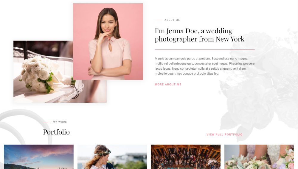
White space is your friend for any type of web design and it’s just as valuable to typography design. It can draw attention to a specific area of text and give it room to do its work. It highlights the text and helps draw attention to it. It keeps the design and the text from feeling cramped or crowded. Give your text modules plenty enough white space to do what you need them to.
The example above is from the Photography child theme.
Ignore Fads and Trends
Fads come and go. There’s always a new fad around the corner. If you use fonts based on fads, your designs will be outdated sooner than later. You’ll soon have to update your design, and if you’re always following the next latest fad, you’ll just have to update it again when that fad wears off. It’s okay to think outside the box, but even then it’s best to stick with solid design principles rather than fads.
Design trends tend to fluctuate, and they also come and go. Just like fads, if we jump on the latest trend because it’s what’s popular we might end up redesigning a layout or logo when the trend wears off. Rather than just blindly following trends, pay attention to those trends to see what works and why. Then, you can incorporate the effective elements of the trends while avoiding the non-effects elements.
Learn to Use the Divi Modules
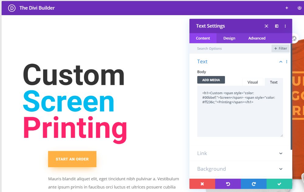
The Divi modules have a lot of options for styling your fonts. You can style them inline, with CSS, or with the settings in the Design tab. Learning the settings and options available to you will open up a lot of design options.
Typography is Art
Think of typography as an art-form. Fonts are not just characters to be placed on the screen. Typography does more for your website than just show text. Fonts are artistically designed to convey elegance and emotion. Fonts can be playful, frightful, serious, or fun. Typography is the part of the site that visitors focus on in order to interact with your website. They see photos, buttons, etc., but the typeface communicates to them and guides them through your calls to action. Thinking of typography as art rather than just a utility will help you think through your font design choices.
Ending Thoughts
That’s our look at the typography rules to help you design better and more successful websites. Also, don’t forget to download the Divi Fonts List to help make choosing your Divi fonts as easy as possible.
Following rules can help make your designs stand out in a good way. Your designs won’t look random. Instead, your typefaces will work with your website to create a cohesive design. These rules are meant to guide you rather than control you. Of course, it’s okay to break or bend the rules, but knowing the rules gives you the knowledge of how to bend or break the rules with purpose and create better designs.
What are your favorite typography rules? Let us know in the comments below.
Thank you! This is a great resource.
As a designer I would love to see the ability to limit the number of fonts in customizer so that clients can only access pre approved fonts in their own page layouts.
You mean ‘widows and orphans’, not ‘windows’.
Just so you know, they are Widows and Orphans, not Windows and Orphans. 😉
Nice article and thanks for the download, very handy.
I wish you would make your blog text darker, it’s difficult to read, at least for me it is.
That’s widows and orphans, not “windows” and orphans 🙂
Thank you! This is a great resource.
Good article, Randy. One typo, however, is that the phrase is “widows and orphans” not “windows”. ?