Slide-in menus, also known as off-canvas or mobile style menus, help clear up space and give your site a clean modern look and feel. With Divi’s built-in settings you can quickly set your navigation bar to slide-in and the standard configurations are fine in most cases, but the styling options are very limited.
In this tutorial, you’ll learn how to:
- Activate Divi’s included slide-in menu to create a cleaner more streamlined navigation design
- Build a and style a custom slide-in menu with CSS
- And, how to make quick styling changes to the hamburger icon used to toggle the slide-in menu
By looking both the built-in and manual options you’ll familiarize yourself with code and expand your design knowledge and get a better knowledge of what’s possible with the standard Divi settings.
Create a Slide-in Menu with the Default Divi Settings
Setting up a basic Slide-in menu with Divi is easy. To enable it, open the theme customizer and go to Header & Navigation > Header Format and choose Slide In from the Header Style dropdown box.
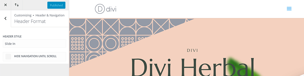
The Divi Slide in option is located in the Customizer options
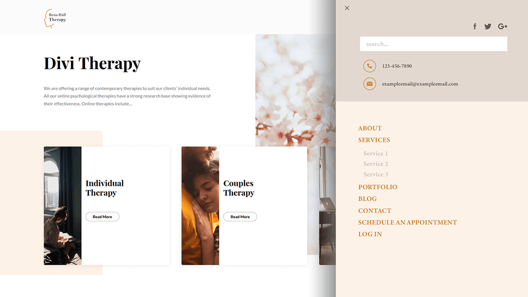
When the icon is clicked, the page is pushed to the left, making room for the menu on the right. The hamburger icon becomes an X. Click the X and the menu closes as the page slide back into place.
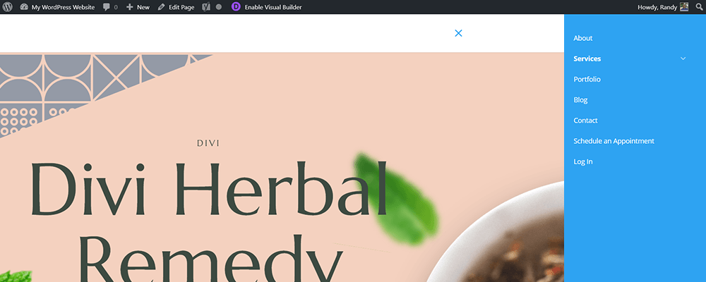
This is what the slide-in menu looks like out-of-the-box but it comes with a bunch of configuration controls
Notice that because the page has been pushed to the left, the site’s logo is no longer showing on the screen.
Styling the Divi Slide-In Menu
To customize the style of your slide-in menu, go to the Header & Navigation > Slide In & Fullscreen Header Settings. Here, you find options to:
- Choose to show the top bar
- Set the menu width
- Change text size
- Set top bar text size
- Edit letter spacing
- Change the font
- Edit the font style
- Set the background color
- Change the menu link color
- And, set your active link color
If you add elements to the top bar you’ll also have adjustments for its text color and the search bar text and background colors.
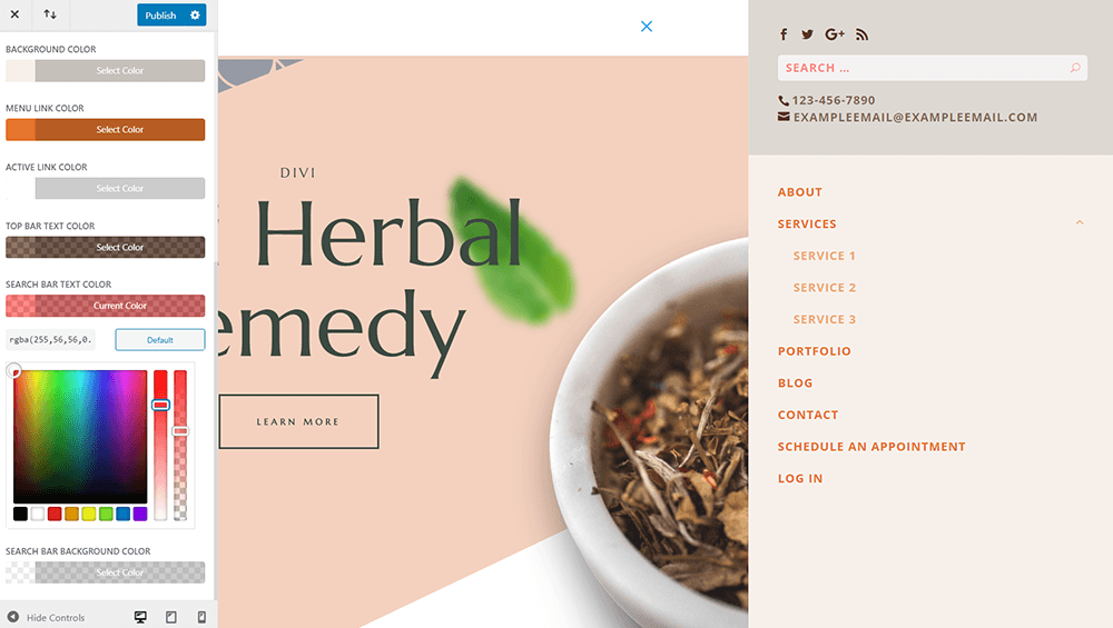
Set colors, size, font, and more
For this example, I’ve adjusted the font and background colors of the primary and top bar separately, and I’ve adjusted the search font and background for the top bar.
As always with Divi, you can quickly achieve some pretty great effects without any code. But what if you want the slide-in menu to come in over your page and don’t want your site logo to disappear?
For this, we’ll use CSS to give our new navigation slider a custom look and feel.
‘CSS Only’ Slide-In Menus for Divi
The biggest advantage of doing it this way is that its light. I mean really light. The whole effect is less than 40 lines of CSS and it takes advantage of the built-in mobile JS, so we won’t be slowing down our site with additional animations.
Divi already has two states for the mobile menu:
.mobile_nav.opened
and
.mobile_nav.closed
By hijacking those you can achieve the desired effect without extra code. Here’s how it all comes together.
First, we need to stop the .mobile_nav.closed selector from setting the mobile menu to
display: none;
You can’t add transitions to an object set so you will need to override it. But you don’t want to see it when it should be closed.
You could push it all the way off-page with something like ‘left: 100%;’ but then you’re dealing with overflow and things get messy before you’ve even started.
Instead, turn the menu sideways with a 90-degree rotation. It’s there, on the right-hand side, but visually, you’d never know.
#mobile_menu { display: block !important; min-height: 100vh; top: 0; border-top: none; padding-top: 80px; z-index: 9998; }

.mobile_nav.closed #mobile_menu {
 transform: rotateY(90deg); -webkit-transform: rotateY(90deg);
 transform-origin: right; -webkit-transform-origin: right;
 background: #fff; transition: .8s ease-in-out !important; }
Now in order to see it again, you just have to rotate it back. Set the origin of the transformation to right, so it kinda looks like it’s coming in on a hinge. This is one of the things that sets it apart from the default Divi slide-in menu.
.mobile_nav.opened #mobile_menu {
 transform: rotateY(0deg); -webkit-transform: rotateY(0deg);
 transform-origin: right; -webkit-transform-origin: right;
 background: #f1f1f1; transition: .8s ease-in-out; }
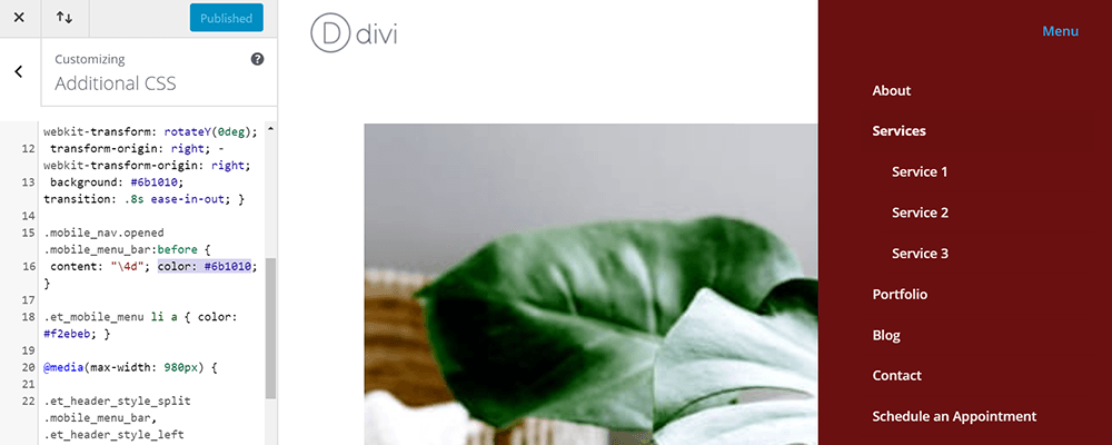
Now a little CSS to style the ‘menu close’ toggle and links. These colors represent a ‘light’ theme. If you’d prefer a dark theme, just invert the colors.
.mobile_nav.opened .mobile_menu_bar:before {
 content: "\4d"; color: #303030; }

.et_mobile_menu li a { color: #303030; }
In order to make sure the menu can be pushed to the very right-hand side we need to make the menu container 100% wide.
Keep in mind, this container is also responsible for keeping the logo and hamburger menu from hugging the sides of the screen so you will need to account for that by adjusting the padding.
Next, adjust the z-indexing of the mobile bar to keep it from disappearing behind the menu.
@media(max-width: 980px) {

.et_header_style_split .mobile_menu_bar, .et_header_style_left .mobile_menu_bar { z-index: 9999; }

#main-header .container.clearfix.et_menu_container { width: 100%; }

.logo_container { padding-left: 30px; }

#et-top-navigation { padding-right: 30px; }

}
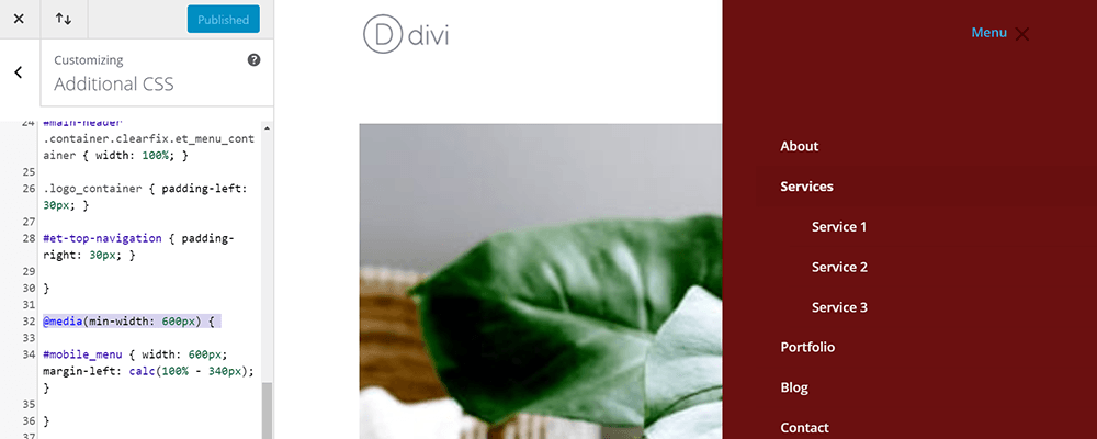
Last but not least, add some queries to ensure that the menu is at least 340px wide until the viewport is smaller than that. Then it switches to 100% width.
Now your manual option should be set!
Things to Consider When Manually Making Changes
- If you’ve got CSS in your customizer for the mobile menu it may conflict so clear it out.
- Also, if you have a fixed header on mobile then you’ll have to change the CSS for #mobile-menu: instead of a min-height of 100vh, just set the height to 100vh and overflow to scroll.
The complete code
If you run into any issues, here is the completed code you can just copy and paste in or use it to compare with your own.
/** Divi Space slide in mobile edits**/

#mobile_menu { display: block !important; min-height: 100vh; top: 0; border-top: none; padding-top: 80px; z-index: 9998; }

.mobile_nav.closed #mobile_menu {
 transform: rotateY(90deg); -webkit-transform: rotateY(90deg);
 transform-origin: right; -webkit-transform-origin: right;
 background: #fff; transition: .8s ease-in-out !important; }

.mobile_nav.opened #mobile_menu {
 transform: rotateY(0deg); -webkit-transform: rotateY(0deg);
 transform-origin: right; -webkit-transform-origin: right;
 background: #f1f1f1; transition: .8s ease-in-out; }

.mobile_nav.opened .mobile_menu_bar:before {
 content: "\4d"; color: #303030; }

.et_mobile_menu li a { color: #303030; }

@media(max-width: 980px) {

.et_header_style_split .mobile_menu_bar, .et_header_style_left .mobile_menu_bar { z-index: 9999; }

#main-header .container.clearfix.et_menu_container { width: 100%; }

.logo_container { padding-left: 30px; }

#et-top-navigation { padding-right: 30px; }

}

@media(min-width: 341px) {

#mobile_menu { width: 340px; margin-left: calc(100% - 340px); }

}

@media(max-width: 340px) {

#mobile_menu { width: 100%; margin-left: 0; }
}
Styling Your Custom CSS
The CSS from this tutorial includes color values and padding. You can change the values of these elements to further customize the look and feel. Enter the hex code of the color or the amount of padding you want. You might need to save and refresh the page to see the changes.
Background color when toggled out
In this example, I’ve changed the values for the background and text colors.
The CSS allows you to have a separate background color for the slide-in effect and the fully opened menu. So you can set the background to one color and then have it change when it is fully-opened as a fun little animation trick.
If you want to change the color values find the tags and adjust the value:
- .mobile_nav.closed = slide in background
- .mobile_nav.opened = fully opened background
- .et_mobile_menu = fonts
You can also change the transition speed and style, margin, width, and more. Elements on your slide-in menu that don’t use custom CSS can still be adjusted with the standard Divi settings form the customizer. Pretty slick.
Here, you can see a new background color for the dropdown menu and some padding adjustments.
Use CSS to set your navigation slide-in background width
Adding padding to the top of the menu brings the links down lower within the menu. You can also change the width of the menu. This is what it looks like if you set the minimum width to 600 pixels.
Expanded (Hamburger-Style) Mobile Menu Options with Divi Switch
Regardless of which of these two methods you use to build your slide-in menu for Divi, you can customize the Divi mobile menu styles further with Divi Switch. Switch lets you both change the mobile menu icon and allows you to add custom text to the icon.
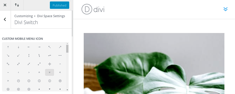
Mobile Menu Icon
Divi Switch adds several Divi hamburger menu styling options to the Theme Customizer. Go to Divi Space Settings > Divi Switch to see the menu settings.
Customize your menu with a different icon for your slide-in menu
Here, you can choose a custom icon from your list of Divi icons. It gives you so many options but for this example, I’ve selected the double down arrow.
Mobile Menu Text
Divi Switch also has a burger menu text option. You can toggle this on, in the Header tab of the Divi Switch settings screen. Just type the text you want to display next to the hamburger icon and save the changes. I’ve added the word “Menu”.
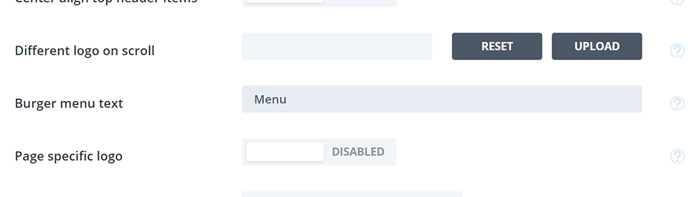
Add your customization in the “Burger menu text” field
Refresh your website and the text will appear next to the hamburger icon. Here’s my example, showing the word “Menu” next to my double down icon.
Now you see the word “menu” next to the icon
Plus, Divi Switch includes +50 other design customizations and features you can implement on your site. Follow our other free how to’s and learn out to use:
- Built-in menu Hover animations
- Custom 404 pages
- Transparent header backgrounds
- And, a bunch more
A little CSS goes a long way with Divi but whether your beginner trying to build your first site DIY or a design professional trying to speed up site development an expansion plugin like Divi Switch goes a long way.
Let us know what you think…
With the built-in features, CSS, and plugins like Divi Switch the options are limitless. We would love to see your design or hear your thoughts. Tell us about it in the comments section below.
Enjoy!
Hi.
It looks great on mobile devices. Can i have this same effect on desktop? How to do it?
Regards
Remik
Open the theme customizer and go to Header & Navigation > Header Format and choose Slide In from the Header Style dropdown box
Doh! I didn’t even know you could click that field!
I was looking for this answer all night!
thanks
I can’t seem to get the custom css to work for the slide in menu. My content is still pushed to the left, when opening the hamburger. My divi built-in menu is set to the slide-in option, maybe this is overriding the custom css? Do I need to put some class names (.mobile_nav.opened or .mobile_nav.closed) anywhere on sections or is it only the css I copy to the custom css field?
Hi Ida, when using custom CSS, all you need to do is copy the CSS and paste it to custom CSS field. You don’t have menu to be set to “slide-in”. Make sure to check if it works on mobile and tablet.
Can I have two types of animation? I want to have the slide in and the regular one
Yes, you can add a custom CSS class to the module and snippet code 🙂
When the menu is opened how can I stop it from pushing the page content to the left and off the screen?
Can you please tell me how to switch the position of the slide in menu to the left? I’d be very grateful. Many thanks.
et_slide_in_menu_container is responsible for the menu section. Its default styling when closed is set to: right: 0 px; display: none;.
When the menu opens the container properties change to: right: -320px; display: block;
In order to place the menu to the left, you would have to change these CSS properties accordingly from right to left.
Great CSS sliding menu. Can we add a logo above of first menu item ? is it possible via CSS or not ? Thank you.
Of course Mustafa. You can use :before selector within the et_mobile_menu class and create a code snippet eg.:
et_mobile_menu:before {
content: url(image.png);
}
Is there anyway to add code to make the menu options appear closed and not open?
Yes, Jay, you can use display:none; property for the menu items (which you can get using inspect element) in the custom CSS section of either your Divi Theme or website.
Nice job. Thanks.
How do you make the hamburger and the X it turns into larger and/or thicker?
You can simply change the menu toggle size by adjusting it using custom CSS code snippet:
.mobile_menu_bar.et_pb_header_toggle { width: 48px; }
How can I add this the slide-in menu for desktop?
This slide-in menu is meant to be implemented in the desktop view of the website. It simply resembles the mobile look of the menu.
How can I add this the slide-in menu for desktop?
This slide-in menu is meant to be implemented in the desktop view of the website. It simply resembles the mobile look of the menu.
I think it does not work with the new DIVI 🙁
We’ve checked and it still does work with the latest Divi. Please confirm if your code is correct, Argus.
I couldn’t get this to work.
Feel free to share what part of the code is unclear for you, Matt. We will try to work this out for you.
Btw, can you share a way to make the menu close when clicking outside the element?
Sure Eivind, you can insert a bit of custom CSS coding to achieve that.
You can check this code snippet: https://codepen.io/FruitMi/pen/QWwpaEK
I love you!
Thank you, Eivind!
Very nice! Is it possible to make the menu come out with a swipe gesture instead of clicking the hamburger menu?
Thanks!
Thank you Josh. In case of implementing a swipe gesture to the menu you might want to check this article: https://css-tricks.com/simple-swipe-with-vanilla-javascript/
You would have to incorporate a little bit of Javascript to this.
thanks works great for the latest version of Divi so others please try again. I just need to know how to not have the sub menu items showing auto open.
thanks.
You can use display:none; by default on the sub menu items, Teresa.
This doesnt work in the new Divi 🙁
We’ve tested this on the latest Divi version and it works, Naomi.
Please try and check your code for mistakes.
Hi there! Is this still doable with the current Divi? Thanks in advance.
Yes, this still works in the latest Divi version.
Few hours back i buy your plugin but my problem is still a problem.i buy this plugin for menu slide over the page but after purchasing ,installing and activation it.it same as previous.
Please help me
Waiting your response
Thanks
What plugin are you exactly referring to? Please contact our support: https://wpzone.co/contact/
We will take care about the issue.
Although Divi has a built-in slide-in menu mode by now, I found this technique interesting because I would like to keep the standard menu mode for desktop, and switch to slide-in on mobile, something Divi cannot do out-of-the-box afaik.
Anyways, I tested your solution and it seems to work great, only problem I have found is that for a long menu (like the one we have on our site), I am loosing the last entries if a screen is too small because I cannot scroll in the menu itself.
Is there a fix for that?
Hi Lars, yes you can set the overflow to scroll and then it’d work just like a normal section overflow.
Great tutorial, thank you!
We’re glad you liked it Aleksandar!
Hi SJ is there anyway to make the menu disappear when the user clicks a menu item, I am using this on a single page site and if the menu could slide out on click that would be great!
You can use the CSS selector :active on the menu items to trigger the slide menu animation.
Is there possibility to make slide in menu from left and push content to the right? Thanks in advance for any comment
Of course, Filip. By default the class et_slide_in_menu_container which is responsible for the slide in menu. It has a property set by default to right: 0px;.
To make it slide in from the left side you would need to set it to left:0px; by default and et_pb_slide_menu_opened class to left:320px; when opened.
Great Article!
It would be nice if you show another example that menu slides horizontally but 3d transformation.
It’s very similar to the example presented in the tutorial, you can use transform: rotate with X, Y or even Z axis instead of the simple slide-in.
Hello very good article . I have a question, how we could make the submenus quedasen not visible until we click on an arrow of top item to display the submenu ? The problem is that when using multiple js DIVI ami the conflict made me do onclick .
Cheers
You can set a class of the submenu to then trigger the content of the submenu to be visible by setting display:block; property.
The submenu contents would need to be set to display:none; by default for this to work.
We recommend using our Divi Switch plugin which has an ability to collapse submenu items inside burger menu
Very nice. Any easy way to also include options for closing this menu, when the user decides to stay on page?
To close the menu you simply click on the ‘X’ button, optionally you can add a link that triggers the slide animation for the div.et_slide_in_menu_container.
Anything without a plugin is a good thing. Great way to leverage native Divi code instead of JS.
Thanks Ray, appreciate you reading and taking the time to comment 🙂
This is really great!! I love it!!
Thanks Peter 🙂