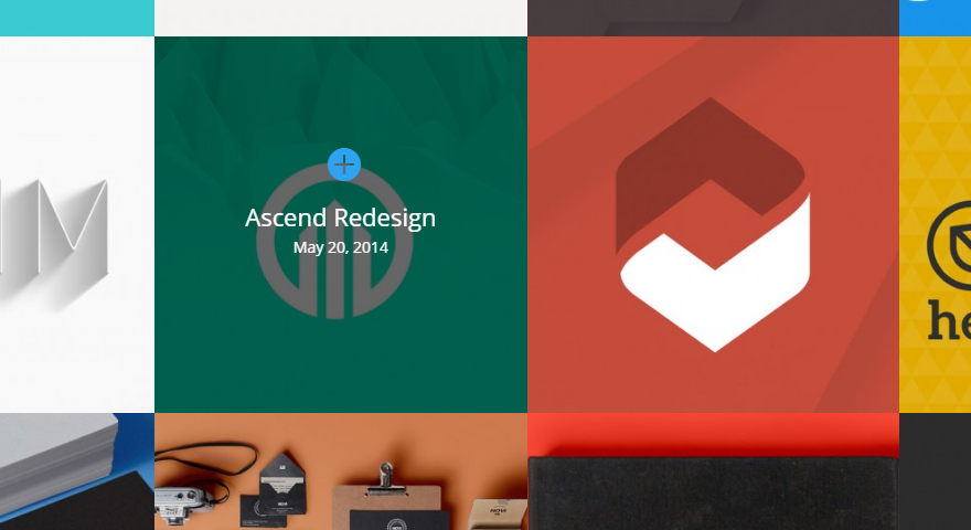
A while back I wrote a CSS snippet for changing the aspect ratio of the Divi Portfolio Grid Module. Ever since, I’ve been asked if the same trick would work on the full-width grid. The short answer is no. The trick I used in that tutorial used trickery to convince the container to treat the padding-top of the image container as the height controller.
The same isn’t possible with the full-width grid, but that’s not to say the result can’t be achieved. In the case of the full-width grid portfolio we need to override inline css that sets the height. We can do that by making the height a portion of the width using what I’ll call the ‘vw trick’.
The VW CSS Trick for dynamic height
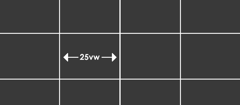
The beauty of fullwidth modules is that they are ‘full width’ or 100% of the viewport. This could be written in CSS as 100vw. If that’s true then one quarter grid item is 25vw wide. To make it square, we just need to make the height 25vw too.
At a point, the grid changes to being three wide (33.3vw), then two wide (50vw) and one wide (100vw) so at those points we’ll match the height to the width again with media queries. Here’s the code…
@media (min-width: 1041px) {
 .et_pb_portfolio_item.et_pb_grid_item { min-width: 25%; height: 25vw !important; }
 .et_pb_portfolio_item.et_pb_grid_item img { max-width: 100%; object-fit: cover; } }

@media (min-width: 785px) and (max-width: 1040px) {
 .et_pb_portfolio_item.et_pb_grid_item { height: 33vw !important; }
 .et_pb_portfolio_item.et_pb_grid_item img { max-width: 100%; object-fit: cover; } }

@media (min-width: 497) and (max-width: 784px) {
 .et_pb_portfolio_item.et_pb_grid_item { height: 50vw !important; }
 .et_pb_portfolio_item.et_pb_grid_item img { max-width: 100%; object-fit: cover; } }

@media (max-width: 496px) {
 .et_pb_portfolio_item.et_pb_grid_item { height: 100vw !important; }
 .et_pb_portfolio_item.et_pb_grid_item img { max-width: 100%; object-fit: cover; } }

.et_pb_fullwidth_portfolio .et_pb_portfolio_image:hover h3 {
 margin-top: 45%;
}
If you wanted to make it a different aspect ratio, you would adjust the vw values to whatever you want. The last selector is for the text on the overlay which will need adjusting if you make the grid items smaller.
I hope you find this useful 🙂
Thank you so much!
It is generous of you to post these hints.
Worked perfectly for me.
Hey Steve, thanks for this trick. Unfortunately, DIVI still uses non-square thumbnail versions of uploaded images, even if those images are square. I guess it’s going to be Java or nothing now, right?
How to apply to divi filterable portfolio?
Many thanks!!!
Thanks for your work!
This works great, except, I have square images that are being cropped. I’m not sure why they are not displaying at 100%. I tried changing “object-fit:” from cover to fill, none, contain, scale-down. None of them display the square image at 100%. If anyone has any suggestions, they would be greatly appreciated.
Thank you for fixing my problems! This rocks. Only thing is, how do I get it to limit the number of tiles? When my browser is full-width it has 4. I’m trying to make it 3 🙂
Hi i was just wondering when I put the code in the Divi Theme options Custom CSS field it works perfectly. Now my concern is if Divi gets updated then I’m going to lose my code.
I tried to put it in my child theme style.css however it didn’t seem to work is that the right spot to be placing this code??…Thank you in advance…David
It should be fine in the Divi Theme Options, you will not lose it on an update. I am not sure why it would not work in the style.css but if it works in DTO just put it there.
I don’t know if this is because of an update or something, but the media queries do not work below 1041px. It just resets back to how it was before on my site
Great! This helps me to understand the CSS layouts a bit. What if you want a more ‘letterboxed’ ratio? My images are 2.35:1, so pretty letterboxed. I’m finding my images in my portfolio are truncated on the left and right. Thanks!
OMG, I love you! I have been on the Elegant Themes forum and no one – not even Elegant Themes can give me an answer about how to do this. You are awesome, Stephen – thank you!
Hello, where should I put this css code ?
Go to Divi Theme options, then scroll to the bottom > paste the code in the “custom CSS” field